Designing with Data and Code
The amazing work of Nadieh Bremer


Ever wonder how gorgeous data visualizations in Scientific American or The New York Times are made? Nadieh Bremer, author of many of those visualizations and her stunning book, Data Sketches, follows a process she calls “Designing with Code.”
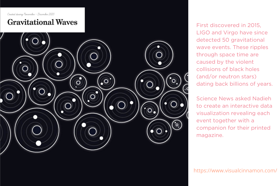
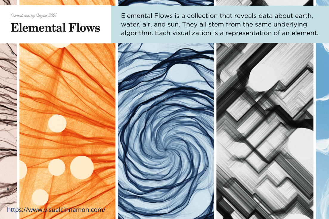
Nadieh's process begins with an empty text file. She uses JavaScript and data to create a rough visualization, like a concept car, for each print (see a few of my favorite finished examples, below).
Then Nadieh follows her curiosity.
She searches for data--any data--and puts in the “hard manual labor” needed to scrape, collect, clean, and understand the raw material using R. She works with data like clay, uncovering stories and forming plots that bring ideas to life and develop understanding.
Once she forms her data story, Nadieh grabs a pen and paper. She draws rough sketches of the final result and exports clean data and code with JavaScript and Microsoft Visual Studio.
For the finished product, she works on the main shapes first and iterates to find a coherent design: colors, fonts, works, and effects. This takes hours and hundreds of iterations. Once she’s happy with the result, she moves the visualization to a vector graphics program like Affinity Designer or Adobe Illustrator for the final edits, titles, text annotations, and legends.
Want to learn more? Me too. Not sure how? Here's how! Nadieh will be our guest at the TIBCO Analytics Forum just ONE MONTH from now. You can learn more about her work and register for TAF now in the links below.