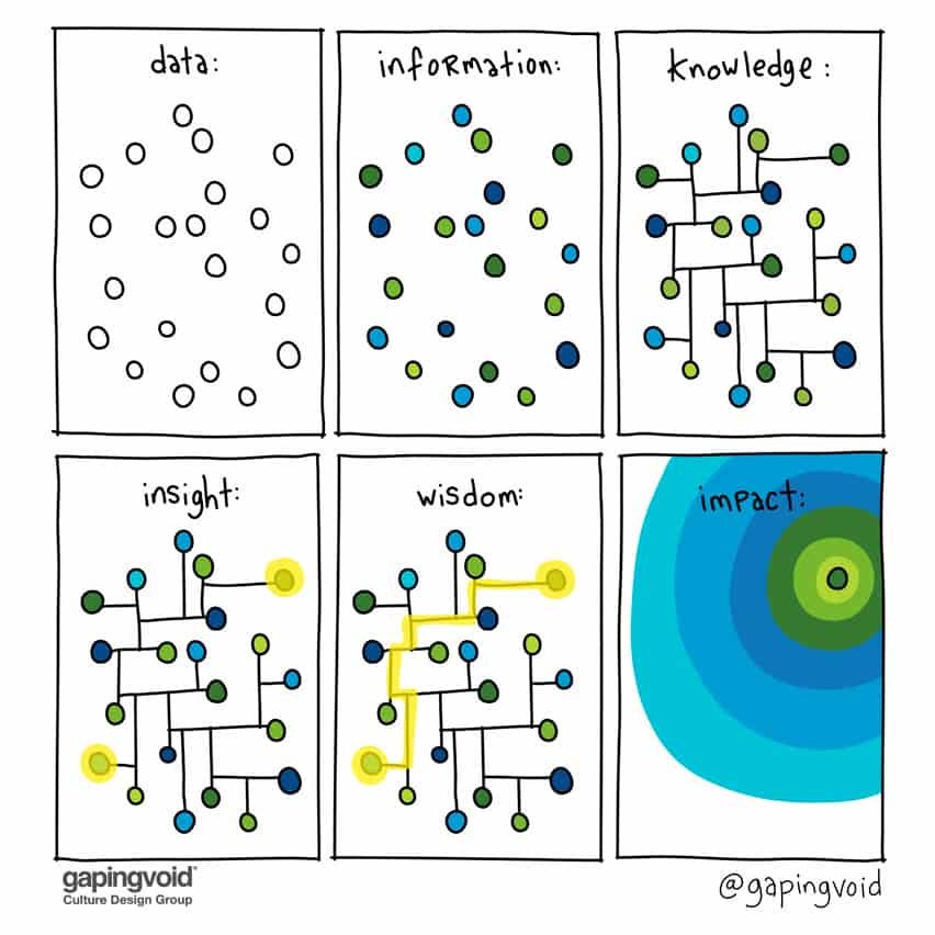
Animating Insight
Animation can explain whatever the mind can conceive—this makes it the most versatile means of mass appreciation. Walt Disney said this, approximately. If he was right, why do we so rarely animate our data?
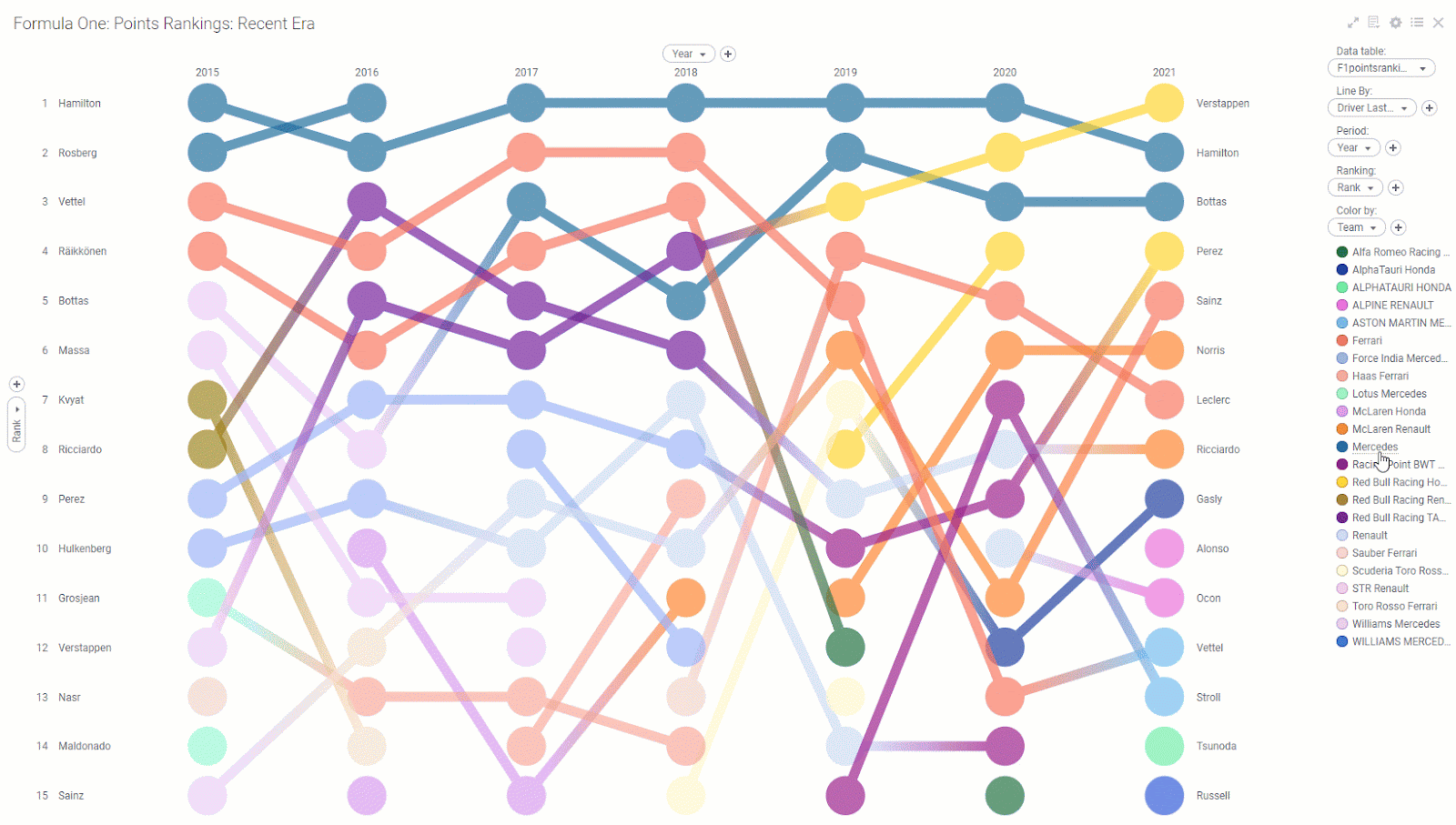
Jason Forrest and his McKinsey COVID Response Center did it. The visualization below animates the month-over-month change in employment in one gorgeous dashboard. The shocking clip below shows the first few months of the pandemic. It’s so good you don’t need a sharpie to explain it.
The McKinsey COVID viz is in my bookmark folder. Try it. Search for your state. Click on your county. Explore. They update the data in real-time, so visit often. Hopefully, we’ll watch it turn white again, together.
* * *
Great visualizations create magical moments of insight for viewers. They can spark a fire to answer new questions. Animation brings data to life. McKinsey’s animated COVID dashboard does all three.
Postscript: Maybe you’re thinking: “Nice viz, but you still didn’t answer; why don’t we see more of them?” I think the answer is simple: they’re tough to make. Time series data is tricky to work with and hard to find. And when you get it, visualizing moving data is an art. My 1.8-second clips take hours to conceptualize and create.
Monday, I shared our latest innovation, the Animated Bubble Chart Spotfire Mod. It’s a mini analytics application that makes it easy to display animated data. Its goal is to make it easier to animated streaming data. Streaming data is becoming easier to capture and use. I can’t wait to see what the community does with these tools next.